*****Let me start by easing your mind a bit. Just because this is called “Part One”, don’t assume that you will have to wait for Part Two for the other half of a program or the other half of a discussion! I can’t stand waiting for such things and I don’t expect any 2068 user reading this to wait either. YOU WILL HAVE A STAND-ALONE PROGRAM WHEN WE ARE THROUGH WITH PART ONE…so read on!
To many a “FRONT END” may be a new term, to others it may already be an old and worn out computer industry buzz word. A FRONT END has come rather loosely to mean any user-friendly working environment for a machine, and is typically replete with fancy fonts, icons & windows. The Front End program is loaded first (or exists in the machine as firmware) and other programs can then be run and manipulated within the new environment.
Epson a few years ago introduced a new computer with such a program, but it ate up memory, slowed down functions to a crawl, and the “many features” got tiring to more experienced users. As is usually the case, others learned from these mistakes and now we have computers like Apple’s MAC which owe all of their appeal to their FRONT ENDS.
Although I use some of these other machines, I believe my favorite is still my 2068! Its design under the hood is elegant; simple, uncommon speed and accuracy, and so easily adaptable! One thing I never had a passion for is the character set (or font) that comes with the 2068. But the problems with the font are also found (and much worse) on the C-64 to IBM’s PC! Let’s look at a few examples to see just what I mean.
Type in the words “big”, “abode” and “pound”. Do the letters look uneven…sort of like my first-grader wrote them? The fact is they ARE uneven. In order for some letters to have tails (descenders and ascenders), compromises are made. The rounded portions of the letters no longer line up! This same thing is evident in capitals as well. Type in the word “BEEF”. Note that all of the horizontals in the middle line up nicely. Now type in “PHRASE”. Few of these line up and the look is disjointed.
Now type in “5010”. Does the “1” look too small? Try “BRIEF”. Does the “I” look too small as well? The lower case makes this even clearer. Type in “whimsical” and “militiaman”. Do some of the letters seem to far apart and others too cramped? All of these problems and similar ones on other machines can all be traced to the fact that each character is forced to be in an eight by eight pixel grid. The “i” will never be as wide as the “m” (although the computer designer has attempted it!).
So what to do…it would be of little use to redo the 2068 font using the UDGs. They are 8X8 grids as well. Some computer models have 5X9, 6X8, or other grid sizes (like the QL) to try to compensate. But the only true way to solve the problem is to let an “i” be an “i” and an “m” be an “m”. This is the way typesetters do it and it is, in fact, the way the MACINTOSH does it. The question is: “Can the 2068 do it?”. The answer is: “Of course!”.
The font I have designed we can call NEW 2068 MEDIUM. It is close to ITC Souvenir Medium with a flavor of Clarendon & Helvetica Condensed for all you typesetters. It still has an eight pixel height but the width varies from eight down to three pixels. I have redefined 98 characters, including graphics which will help us with icons, headers and windows later on. If you don’t like some of my characters, I won’t be offended if you alter them. After all, that’s what I’m doing to Uncle Clive’s set! If you have a revelation, send it to me, I might want to use it myself!
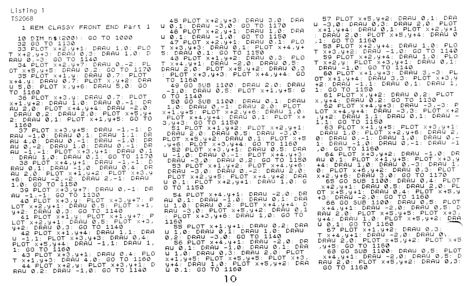
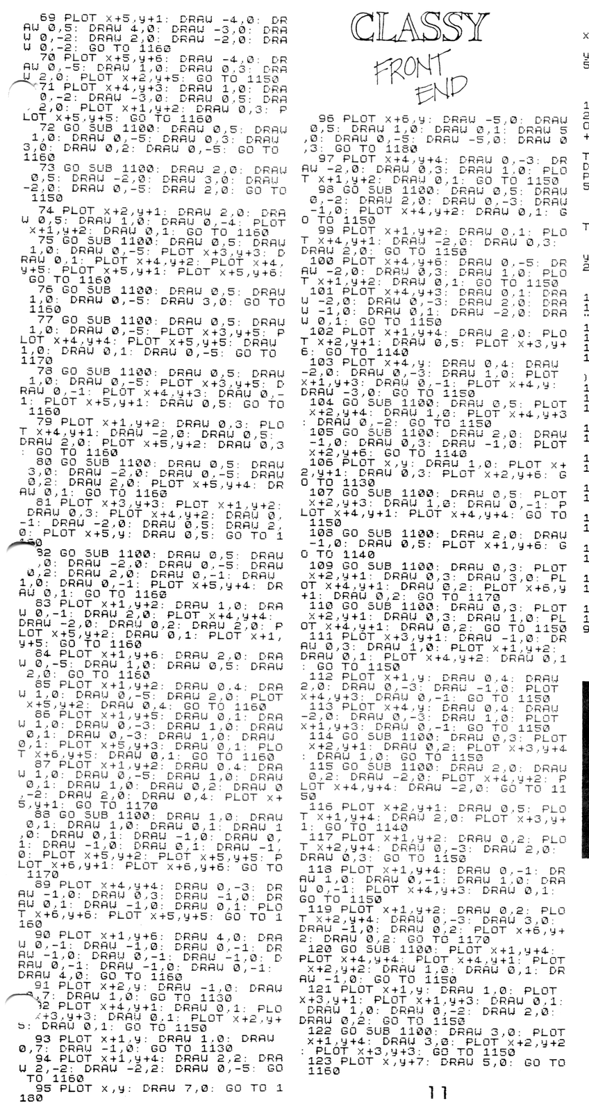
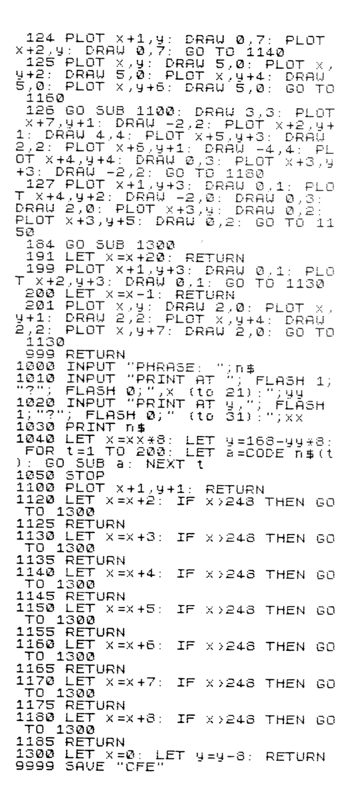
To print the new font, we cannot easily use the PRINT command. But then the 2068 has at least three ways to put things on the screen. We will use the PLOT routines as they address the screen by pixels and coordinates can be altered easily to accomodate the new three to eight widths. Listing 1 is a program in BASIC and is simple to alter. The program reads the coordinates from lines of BASIC, so can be used along with any programs you care to write. It does not overwrite or interfere with normal 2068 printing, so both can be used at once if you wish!
In Part Two we will look at the machine code version of this program which is faster and can reside most anywhere in memory. For those who have been enjoying the excellent Z80 code lessons in TDM by Syd Wyncoop for the past year, this will be a treat. Most of the instructions have been covered in his articles already!
Although Listing 1 looks incredibly long, it is oh so simple! Line 1000 is the main loop which reads a line of standard 2068 text. It will jump to line 33 to 201, depending on which character code the loop finds next. Simple, huh? If you wish to find which program line draws which character, just look up the character code number…they are listed in the 2068 manual starting with page 239. The rest of the program is housecleaning like keeping track of the end of the screen.
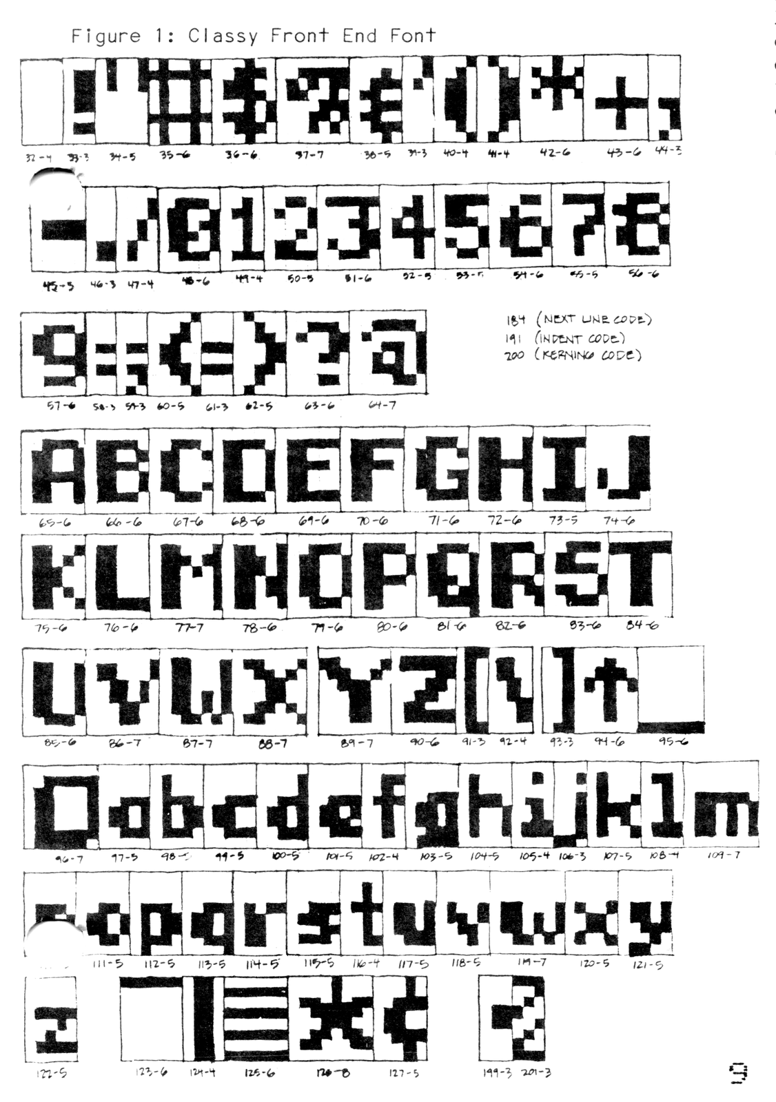
In Figure 1 are sketches of each of the 98 characters in the new font. Under each is the character code and a number showing the pixel width. Most are the same symbol as the original set, four have changed greatly, five were not symbols before but are now. Let’s now go over the changes. Number 96 was the famous pound symbol but is now a square icon throwing a shadow. Number 123 (a bracket) is now an inverted underline symbol. Number 124 a graphic symbol on British machines and the STICK command on the 2068 is now a bar symbol (we come full circle!). Number 125 was a bracket and is now a series of lines. Number 126 also a graphic symbol on British machines and the FREE command on the 2068 is now a star. Number 127 was a seldom used copyright symbol and is now the cent symbol. Number 199 was the “less than/equal” symbol and is now a small black square. Number 200 was the “greater than/equal” symbol but is now a special code for “Kerning”. Typesetters use this to fit letters like “L” and “Y” closer together than they would normally be. Number 184 was the LN symbol but we will use it as a special code to jump to the next line. Number 191 was IN but we will use this as a code to indent twenty spaces. Last is number 201 which was a “does not equal” symbol and is now a hatched line symbol. The usefulness of some of these will become apparent in later discussions, but are fun to experiment with now.
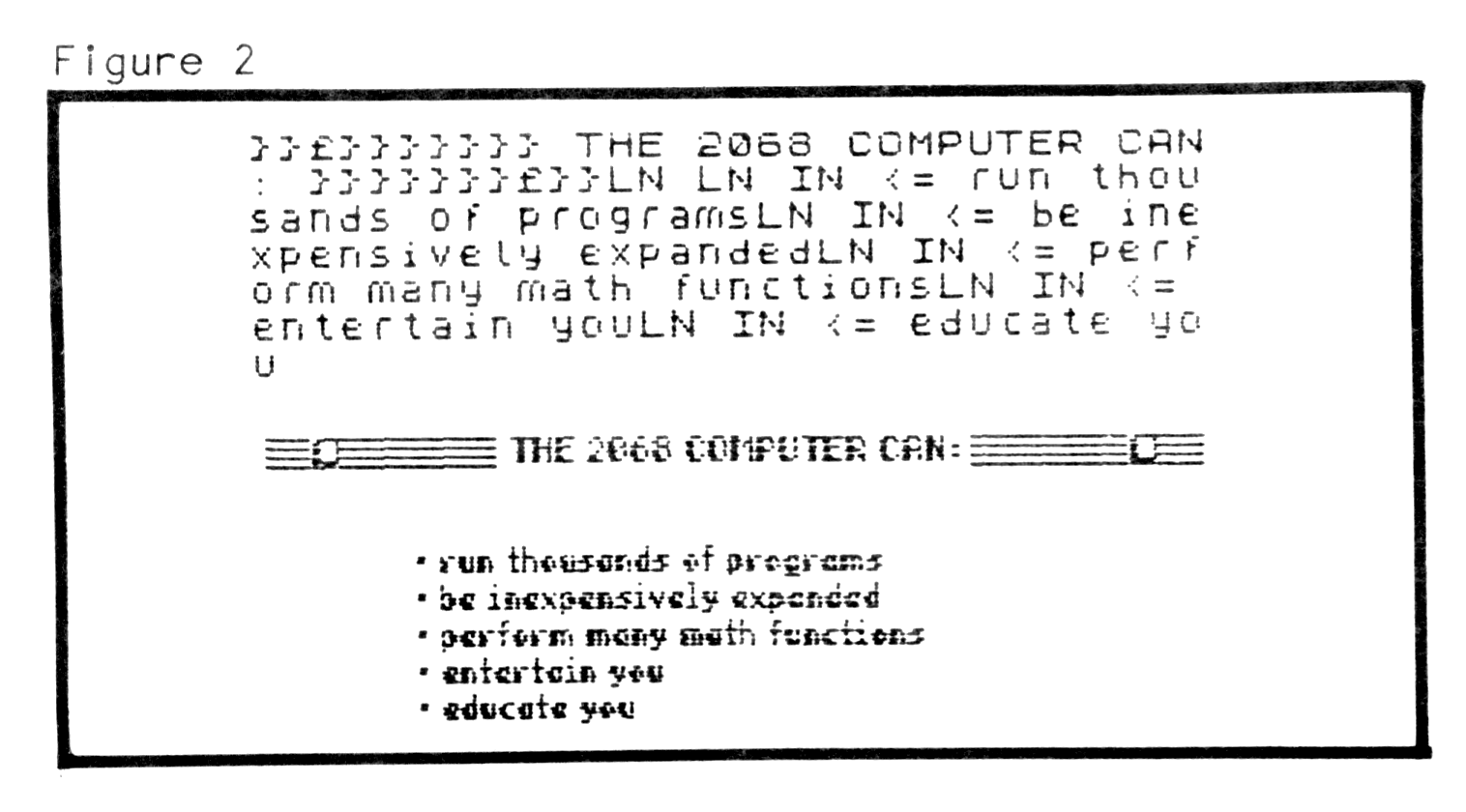
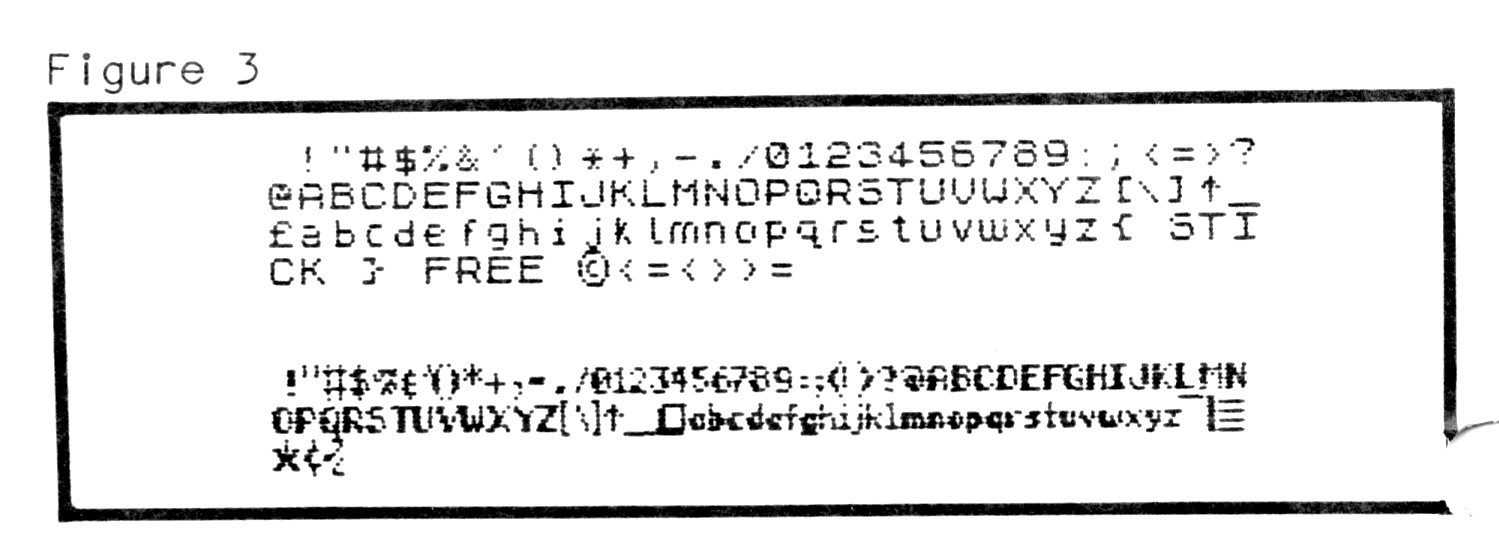
Experimenting will show that even though all the new font’s characters are the same height as the original Sinclair set, the spaces have been eliminated. A line of mixed text can now contain sixty or more characters per line! Try out the new symbols and the kerning code. Some possiblilities are shown in Figures 2 and 3. If the listing is beyond your patience to type in, send $4 and I’ll send you a copy on tape. Send ideas and any questions you have, too, if you like! My address is: Paul Bingham, POB 2034, Mesa, AZ 85204. See you next time!
Listing 1 (TS2068)